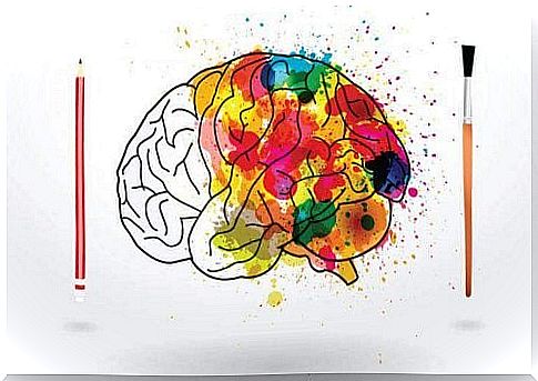
The Psychology Of Color: Meaning And Curiosity
Talking about color psychology means talking about emotions, about a language capable of evoking feelings of pleasure, well-being, enthusiasm and vitality. A universe that goes far beyond the world of marketing and which often has its roots in our personal experiences, in our childhood and in a psychological symbolism that science has always tried to reveal.
Claude Monet always said that the world of color was his daily obsession, his joy and also his torment. If it is not easy for an artist to grasp the depth of each tone and each combination, it is even more difficult to define how each tone affects the human being and his behavior.
There are those who talk about pseudoscience, and in a certain way there is a “small” truth in this, because color has a lot to do with our personal tastes, with our experiences, with our growth and also with our cultural differences. However, and this is perhaps the most interesting aspect, we have a large amount of studies that explain how people react to certain colors or which ones are, on average, the most popular.
The psychologist, sociologist and professor of communication theory Eva Heller after years of study, research and observation, has come up with really interesting data, which in turn coincides with many of those that had been obtained before and were obtained later.
For information purposes, we can anticipate a fact: the most popular color is blue.
Psychology of color: what is its purpose?
Color stimulates the brain in different ways, to the extent that Egyptians and Chinese in the past used the effect of colors to heal or promote certain states of consciousness or emotional states. Ancient art was also meticulous in the choice of colors: for example, red was for the Egyptians the reflection of life, earth, victory and even the wrath or fury of hostile gods such as Seth or Apopi.
Color is much more than an optical phenomenon. Each color has its own meaning that has a certain impact on the brain and, therefore, the psychology of color today is a fundamental tool for neuromarketing. Understanding how the consumer reacts to certain color stimuli allows an increase in purchases, and even if its effect is not 100% infallible, similar reaction patterns are observed, which confirm the usefulness of the psychology of color.
We cannot forget the effect that color has in the world of art and cinema. David Lynch, for example, is one of the directors who most tries to escape the world of logic to immerse himself in the subtle kaleidoscope of emotions; in his works he always uses strong contrasts between black and white to symbolize the escape from the real world to the dream world.
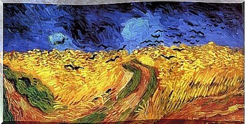
Van Gogh also deliberately chose certain tones to manifest his emotional states, always letting the more vivid shades such as yellow or blue shape his fields and starry nights.
Meaning and curiosity of each color
To immerse ourselves in the psychological universe of each color, we will follow the studies conducted by Dr. Eva Heller, as well as the current works of the American psychologist and professor Stanford Jennifer Aaker, who recently developed an interesting analysis of colors applied to the world of neuromarketing. .
The blue
- Blue is the color most used by companies as it is productive and non-invasive.
- It is a color that suggests a feeling of security and trust in a brand.
- Blue has been shown to quench hunger, so it is avoided when it comes to promoting foods.
- It is the color of harmony, fidelity and sympathy.
- It is the coldest color, yet it is tied to the concept of spirituality and fantasy.
- There are 111 shades of blue.
- It is a primary color and the shade of blue most appreciated by painters is ultramarine blue, the most expensive, but the one that gives the paintings an exceptional vividness.
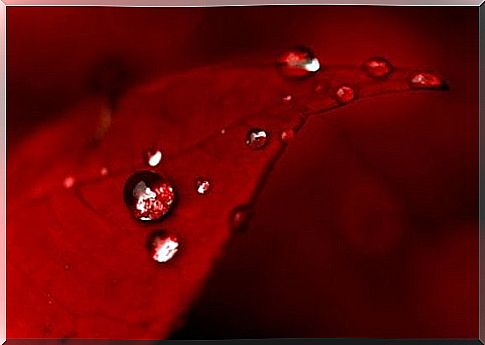
The Red
- Red is another of the most used colors in marketing: it stands out from the rest of the color range, is more pregnant and is used to attract attention.
- It increases the heart rate and creates a feeling of urgency, danger or immediacy.
- It is used to stimulate the appetite and promote the appearance of impulses.
- It represents love, but also hate.
- It is the color of kings, of happiness and danger.
- Represents blood and life.
- It is a dynamic and seductive color, able to awaken our more aggressive side.
The yellow
- In marketing it represents optimism and youth.
- It demonstrates clarity and is usually used to draw attention to certain products displayed in the window.
- This color cannot be abused in stores, as it quickly tires the eyes. It is mainly used in the more distant shelves rather than in the more central ones.
- Studies have shown that deep yellow tones stimulate crying in babies.
- According to experts in color psychology, it is a contradictory color: it represents both good and evil, optimism and jealousy, understanding and betrayal.
- Illuminates and promotes creativity.
- It is a masculine color, and in China it represents imperial institutions.
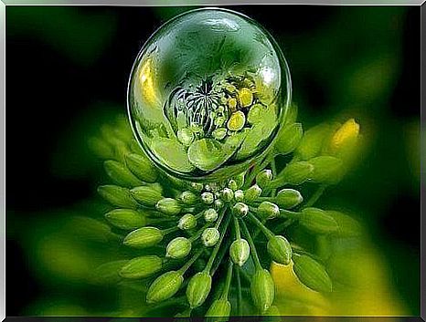
The green
- Green is the color of growth, renewal and rebirth.
- It is associated with health, nature, freshness and peace.
- It promotes problem solving, as well as freedom, healing and tranquility.
- The dull green represents money, the economic side and the bourgeoisie.
- There are more than 100 shades of green, the intermediates of which favor the mood.
- It also represents incipient love.
- It is a relaxing color, in fact it is useful for people who are going through a depressive phase.
The black
- Black color is associated with elegance, secret, mystery and power.
- It causes strong emotions, it is an authoritarian color.
- In the world of fashion it is considered a color that gives style and gives sophistication.
- There are 50 shades of black.
- It also symbolizes the end of something, death, loss.
- In the past it represented the priests, now the conservatives.
- In the world of physics, black has the property of absorbing 100% incident light and, therefore, does not reflect any longitude of the spectrum; for this reason, throughout history this color has always been associated with danger, wickedness and the afterlife.
The White
- The white color symbolizes innocence and purity.
- It represents the beginning, the will to start something new.
- It brings breadth and honesty to a space, as well as a feeling of peace, healing and tranquility.
- It is associated with perfection.
- There are 67 shades of white.
- The white collar of the clothes symbolizes social status.
The lilac
- In marketing, it is frequently used in beauty and anti-aging products.
- Brings calm.
- Many brands use it to represent creativity, imagination and wisdom.
- It associates with the feminine, magical and spiritual world.
- There are 41 shades of lilac.
- Used with intensity, it generates ambivalence: it is not advisable to paint walls, rooms or shops with this color.
- Lilac also symbolizes power, but ambiguous one.
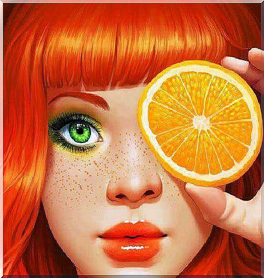
Orange
- In marketing it is associated with enthusiasm for shopping, it reflects emotion and warmth.
- However, if you use intense orange, this can be associated with aggression, so you need to make it gentle, friendly and comfortable.
- It is one of the favorite colors in the world of advertising, because it pushes to buy.
- It is associated with transformation and Buddhism.
- Orange promotes positive emotions and also generates a sensation of “flavor”.
The pink
- Symbolizes wonder and courtesy.
- In marketing it is associated with the world of children and romance.
- It is the color of erotic tenderness.
- It symbolizes tenderness, infantility, all that is small.
- It was Madame de Pompadour’s favorite color.
In conclusion, it is likely that many of you do not see yourself identified in these descriptions, or perhaps you do. As we said at the beginning, the impact of each color often corresponds to part of our experiences. However, commercially and artistically, these fundamentals are always useful and effective.
S also e know that missing from this list different colors, such as brown, golden, silver and gray. We have limited ourselves to describing those that have a greater impact on us, those that in the world of art and neuormarketing are used more frequently and who, almost without realizing it, decorate our lives, influencing us secretly.
Images courtesy of Sakimichan, Marina Melvik